ShopDreamUp AI ArtDreamUp

Deviation Actions


Suggested Deviants


Suggested Collections


You Might Like…


Featured in Groups


Description
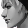
Another Poke-fanart. This time, Umbreon. 
Check out Espeon: [link]
And I even thought that I couldn't draw any better pic than The Espeon, but I like the Umbreon more now.
Colouring black has been my worst enemy for ages, but now I know how to deal with it.
And scanner had no match with me and Polychromos.
He did good job on Umbreon.
(but special paper came out more brown than usual colour yellow-beige - =(") )
)
---
done with Polychromos, white ink. on special paper. ( ) in about 8-9 hours.
11am - 1 pm, (monday) then 7:30pm-2am (tuesday) ...
---
Original for sale here: [link]
-SOLD!-
CRITIQUE PLEASE!
Check out Espeon: [link]
And I even thought that I couldn't draw any better pic than The Espeon, but I like the Umbreon more now.
Colouring black has been my worst enemy for ages, but now I know how to deal with it.
And scanner had no match with me and Polychromos.
He did good job on Umbreon.
(but special paper came out more brown than usual colour yellow-beige
---
done with Polychromos, white ink. on special paper. (
11am - 1 pm, (monday) then 7:30pm-2am (tuesday) ...
---
-SOLD!-
CRITIQUE PLEASE!
Image size
1464x2045px 2.4 MB
Make
HP
Model
HP Scanjet djf300
Date Taken
Aug 25, 2009, 1:15:33 PM
© 2009 - 2024 Psychocereals
Comments108
Join the community to add your comment. Already a deviant? Log In
I think the first thing that catches my attention on this awesome piece is the shape and contrast on the left ear. Like the Espeon picture, I enjoy the wild shapes you have going on here. GREAT effect! The fur in this picture shows you have improved from that on Espeon’s, hence why I did not put much emphasis on that comment.
Now, unlike in Espeon’s picture, I feel the thick outlines on the flames work really well mostly because the coloring on them is darker. Really combines well with the title. In my head, the coloring is an offshoot of stereotypical black light (purple).
Another thing I notice is that… well… the white dots for some reason do not detract as back on this one. Why, I am not sure. But I would still say the dots should be affected by the shading on the body rather then a single flat light.
But there is one feature that really irritates me on this picture. That tail and its yellow stripe. It is solid in the sense that it is a straight ribbon, totally not what that tail is. The easy correction for future uses is to continue that “jagged” outline effect you have on the outline of the tail for that yellow. My best Umbreon pictures are flawed because for some reason I did not show that very well. In other words, the boarder fur on the stripes should be clumped, both the black fur overlapping the yellow and the yellow overlapping the black.
My last comment on this is just a nitpick. That hind leg oval marking looks a tad flat. Why? Well, maybe it is just me because I think to “mathematically” but the right side of the marking needs “foreshortening.” My way of doing this would be when the marking’s right half starts to curve and become vertical, it should be steeper then the left half. In this case, one ought to be able to see the boarder of the inner yellow boundary of the yellow oval. This does not mean the whole thing should be visible but rather just a little yellow strip where the leg curves back and disappears behind Umbreon.
That effect would look very similar to what you did on the left front leg. In fact, I probably could have just saved all that typing and say you should have done that on that hind leg, but I will preserve that text anyways.
The last thing is just a remark, not to be taken as wrong or right. Both hind legs’ rings are not symmetrical on the body. Personally, I can see that as either an interesting thing or a negative thing, but it does not really matter.
I personally love this picture more then Espeon. ^^